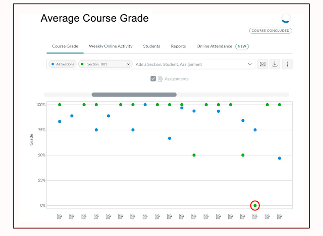
For example, the image below is from the New Analytics tool in a Canvas course site. Grades for course assignments for the entire class are represented by blue dots; grades for Section 001 are represented by green dots. In this way, the New Analytics tool usefully helps the instructor compare grades across sections. We see an interesting anomaly: notice the green dot at the very bottom of the graph (circled in red). While students in Section 001 have otherwise outperformed the class as a whole, on this assignment their collective grade indicates 0%. What is happening here?
 |
| New Analytics Average Course Grade Dashboard |
When we put this question to faculty in a recent workshop, their responses included:
- technical difficulties (the students could not submit the assignment),
- design issues (students couldn’t find the assignment), or
- a gradebook error.
Design for useful data
Many variables can impact the data you see. Clarity and consistency in course design can help create meaningful data. Usability impacts your students’ ability to find and use your course content. The same practices that enhance usability will assure that the learning data displays in a way that is consistent with the logic of your course and will therefore help you understand and use the data. Here are some guidelines:Use due dates
- Not only is this important information for your students, but due dates also help organize data and allow you to see classroom trends.
Put all assessments in the Canvas Gradebook
For the data to provide a holistic insight into the course all assignments and activities need to be included in the Canvas Gradebook.
- For in-class presentations or assignments submitted in person, instructors should create a no-submission assignment. This creates a column in the Canvas Gradebook so those assignments can be manually graded.
- When using external tools, instructors may need to adjust assignment settings.
Use Modules
- Modules allow instructors to organize and sequence course materials. Used in conjunction with course due dates, Modules help you and your students be aware of course structure which impacts data collection and analysis.
Recognize how technology impacts data
Many variables can impact how data is reported and result in an incomplete picture of the learning environment. Examples include:- Only materials in the Canvas course site can generate data. Links to sites or materials outside of the Canvas site (i.e. Google docs, links to websites, or external videos) will not generate data within Canvas.
- The way you embed a video in a Canvas course site impacts analytics. Be sure to enable video analytic tracking by using appropriate Kaltura publishing options.
- Some web browsers block analytics. If your students use any of these browsers your data will be incomplete.
Engage and respect learners
Returning to the anomaly of the 0% earned by students in Section 001, the simple truth is that the instructor offered students a choice: they could pick and choose from a number of assignments. No students in in course Section 001 chose to complete this particular assignment. In our example, the apparent anomaly would be clear to the instructor who understands the course context. But often the data gives rise to questions that the instructor might want to explore.Canvas data provides a starting point, but the numbers don’t speak for themselves. Your students can provide valuable insights in understanding your course data.
- Engage students as partners in improving learning environments. When asking for student feedback,
- let them know that the data collected is being used to make your course better, and
- emphasize that they can play a role in improving the course by helping you understand the data you see.
- Conversations with peers and support professionals can also provide you with useful insights into learning data.
Learners are whole and complex human beings and cannot be reduced to and defined by the learning data used on their behalf. When looking at data, instructors should focus their efforts on the positive impacts this data can have on teaching and learning.
Resources
- Using Learning Data to Understand Student Engagement
- Learning Analytics: Insights and Advice from Students
- For more information about Canvas New Analytics, see this short video, Canvas New Analytics: Gain Valuable Insights into Your Instructional Questions (4:31).
- To learn more about learning analytics, Canvas tools that provide access to data, and sustainable practices around learning analytics, go to the Learning Analytics Canvas site.
Acknowledgments
This post was co-written with Melissa Falldin, Instructional Designer, College of Education & Human Development.

